Difference between revisions of "Line Graph"
(→Examples) |
|||
| Line 30: | Line 30: | ||
|[[File:LineGraph1.png|center|400px]] | |[[File:LineGraph1.png|center|400px]] | ||
|- | |- | ||
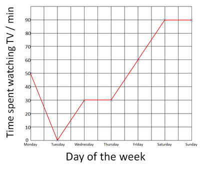
| − | | style="height:20px; width:400px; text-align:center;" | | + | | style="height:20px; width:400px; text-align:center;" |The day of the week is plotted on the X-axis, the number of minutes spent watching TV each day is plotted on the y-axis. |
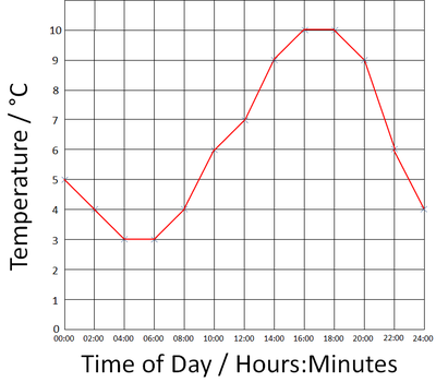
| − | | style="height:20px; width:400px; text-align:center;" | | + | | style="height:20px; width:400px; text-align:center;" |The Time of Day is plotted on the x-axis and the temperature is plotted on the y-axis. |
|} | |} | ||
Revision as of 12:27, 22 August 2018
Key Stage 2
Meaning
A line graph is a graph where you join the points with straight lines.
About Line Graphs
- Line graphs are used to show changes over time.
- Time is always plotted on the x-axis.
- The variable that is being counted or measured goes on the y-axis.
Drawing a Line Graph
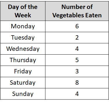
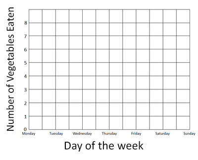
| Use the results table to find the highest number. (On this graph it's 8). | Days of the week is on the x-axis and number of vegetables on the y-axis. Add the numbers to the axes up the highest number. |
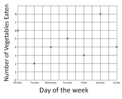
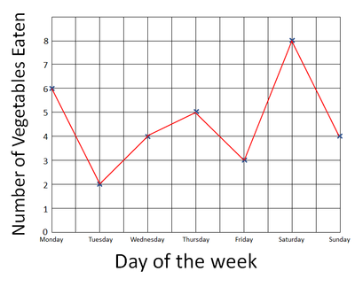
| Plot the points on the graph using an X at each point. | Join the X's with a line going from left to right. |
Examples
| The day of the week is plotted on the X-axis, the number of minutes spent watching TV each day is plotted on the y-axis. | The Time of Day is plotted on the x-axis and the temperature is plotted on the y-axis. |
