Difference between revisions of "Pie Chart"
| Line 14: | Line 14: | ||
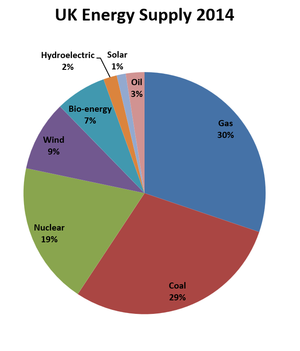
| style="height:20px; width:300px; text-align:center;" |A '''pie chart''' showing the different sources of [[electricity]] for the United Kingdom in 2014. | | style="height:20px; width:300px; text-align:center;" |A '''pie chart''' showing the different sources of [[electricity]] for the United Kingdom in 2014. | ||
|} | |} | ||
| + | |||
| + | |||
| + | ===References=== | ||
| + | ====AQA==== | ||
| + | |||
| + | :[https://www.amazon.co.uk/gp/product/0008158762/ref=as_li_tl?ie=UTF8&camp=1634&creative=6738&creativeASIN=0008158762&linkCode=as2&tag=nrjc-21&linkId=a0fffa35b3ea49a63404f6704e0df7cc ''Pie chart (maths), page 348, GCSE Chemistry; Student Book, Collins, AQA ''] | ||
Latest revision as of 21:21, 10 November 2019
Key Stage 3
Meaning
A pie chart is a circular graph which is divided into slices where each slice represents a proportion of the whole.
About Pie Charts
- Pie charts make it easier to compare the size of different fractions.
Examples
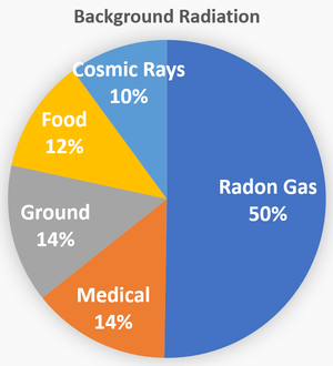
| A pie chart showing the sources of dangerous radiation humans are exposed to. | A pie chart showing the different sources of electricity for the United Kingdom in 2014. |

