Line Graph
Contents
Key Stage 2
Meaning
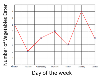
A line graph is a graph where you join the points with straight lines.
About Line Graphs
- Line graphs are used to show changes over time.
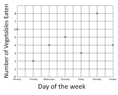
- Line graphs use x's to plot points on the graph.
- Time is always plotted on the x-axis.
- The variable that is being counted or measured goes on the y-axis.
Plotting a Line Graph
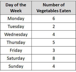
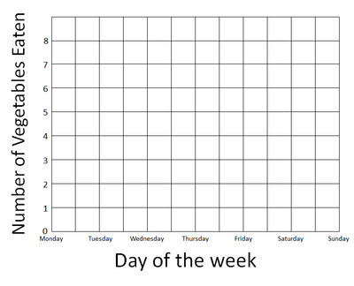
| Use the results table to find the highest number. (On this table it's 8). | Days of the week is on the x-axis and number of vegetables on the y-axis. Add the numbers to the axes up to the highest number. |
| Plot the points on the graph using an X at each point. | Join the X's with a line going from left to right. |
Examples
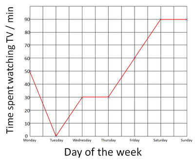
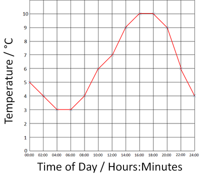
| The day of the week is plotted on the X-axis, the number of minutes spent watching TV each day is plotted on the y-axis. | The Time of Day is plotted on the x-axis and the temperature is plotted on the y-axis. |
Note to Teachers
Students enter KS3 generally very good at plotting line graphs. However, these graphs of rarely used in science and are frequently confused with scatter graphs which are far more widely used and useful in KS3, KS4 and KS5.
Key Stage 3
Meaning
A line graph is a graph in which the points are joined with straight lines.
About Line Graphs
- Line graphs are used to show changes over time.
- Line graphs use x's to plot points on the graph.
- Time is always plotted on the x-axis.
- The variable that is being counted or measured goes on the y-axis.
Examples
| The day of the week is plotted on the X-axis, the number of minutes spent watching TV each day is plotted on the y-axis. | The Time of Day is plotted on the x-axis and the temperature is plotted on the y-axis. |
Key Stage 4
Meaning
A line graph is a graph in which the points are joined with straight lines.
About Line Graphs
- Line graphs are used to show changes over time.
- Line graphs use x's to plot points on the graph.
- Time is always plotted on the x-axis.
- The variable that is being counted or measured goes on the y-axis.
Examples
| The day of the week is plotted on the X-axis, the number of minutes spent watching TV each day is plotted on the y-axis. | The Time of Day is plotted on the x-axis and the temperature is plotted on the y-axis. |
References
AQA
- Line graphs, page 268, GCSE Chemistry; Third Edition, Oxford University Press, AQA
- Line graphs, page 281, GCSE Physics; Third Edition, Oxford University Press, AQA
- Line graphs, page 7, GCSE Biology; The Revision Guide, CGP, AQA
- Line graphs, pages 56, GCSE Combined Science Trilogy 2, Hodder, AQA
Edexcel
- Line graphs, page 131, GCSE Combined Science; The Revision Guide, CGP, Edexcel
- Line graphs, pages 8, 80, GCSE Chemistry; The Revision Guide, CGP, Edexcel
