Scatter Graph
Contents
Key Stage 2
Meaning
A scatter graph is a graph that can be used to make predictions from an experiment.
About Scatter Graphs
- Scatter graphs use x's to plot points on the graph.
- A single line is drawn on a scatter graph called a line of best fit.
- The variable you change in the experiment goes on the x-axis.
- The variable you measure or count goes on the y-axis.
Plotting a Scatter Graph
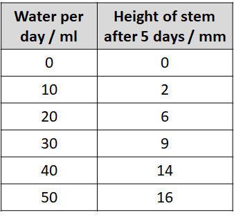
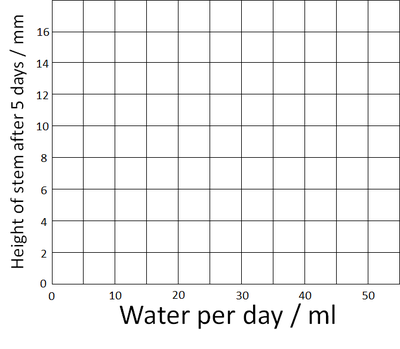
| Use the results table to find the highest number. (On this table it's 16). | Amount of water was chosen to it goes on the x-axis and the height of the stem goes on the y-axis. Add the numbers on the axes up to the highest number. |
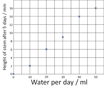
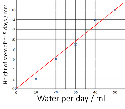
| Plot the points on the graph using an X at each point. | Draw one straight line of best fit to the graph.
We can use this line to predict that the stem would have grown 8mm if we'd given it 25ml of water each day. |
Experiments for Scatter Graphs
Air Resistance and Weight
- Time how long it takes a single Cupcake case to fall from the ground from 1.5 metres high.
- Repeat this for two, three, four and five cupcake cases stacked together.
- This changes the weight without changing the shape of the object.
- If the difference is too small for meaningful results try 2, 4, 6, 8 and 10 cases.
- Plot the results on a Scatter Graph (not a line graph or bar chart).
Air Resistance and Size
- Cut several different size parachutes from bin liners.
- Ensure that the surface area of each parachute increases by the same amount each time. This can support math skills calculating area of shapes.
- Use string to attach the parachutes to the same piece of plastacine each time.
- Plot the results on a Scatter Graph (not a line graph or bar chart).
Key Stage 3
Meaning
A scatter graph is a graph that can be used to show correlations between two variables.
About Scatter Graphs
- The independent variable is plotted on the x-axis.
- The dependent variable is plotted on the y-axis.
- Scatter graphs use x's to plot points on the graph.
- A single line is drawn on a scatter graph called a line of best fit.
- The line of best fit may be a straight line or a curved line that shows a trend in the data.
Examples
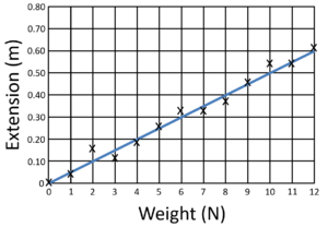
| This scatter graph shows a positive correlation with a straight line of best fit which goes through zero, showing the relationship is directly proportional. |
Key Stage 4
Meaning
A scatter graph is a graph that can be used to show correlations between two variables.
About Scatter Graphs
- The independent variable is plotted on the x-axis.
- The dependent variable is plotted on the y-axis.
- Scatter graphs use x's to plot points on the graph.
- A single line is drawn on a scatter graph called a line of best fit.
- The line of best fit may be a straight line or a curved line that shows a trend in the data.
Examples
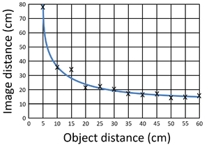
| This scatter graph shows a positive correlation with a straight line of best fit which goes through zero, showing the relationship is directly proportional. | This scatter graph shows a negative correlation with curved line of best fit showing the relationship is inversely proportional. |
References
AQA
- Scatter graphs, page 268, GCSE Chemistry; Third Edition, Oxford University Press, AQA
- Scatter graphs, pages 263, 281, GCSE Physics; Third Edition, Oxford University Press, AQA
- Scatter graphs, pages 56, GCSE Combined Science Trilogy 2, Hodder, AQA
- Scatter graphs; Correlation, pages 115-16, GCSE Combined Science Trilogy 2, Hodder, AQA
