Difference between revisions of "Scatter Graph"
| Line 16: | Line 16: | ||
|[[File:ScatterGraphPt1.png|center|400px]] | |[[File:ScatterGraphPt1.png|center|400px]] | ||
|- | |- | ||
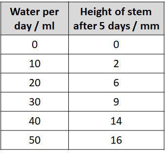
| − | | style="height:20px; width:400px; text-align:center;" | | + | | style="height:20px; width:400px; text-align:center;" |Use the results table to find the highest number. (On this table it's 16). |
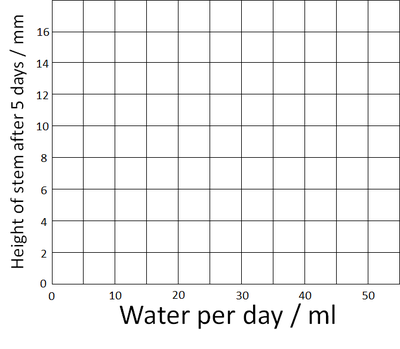
| − | | style="height:20px; width:400px; text-align:center;" | | + | | style="height:20px; width:400px; text-align:center;" |Amount of water was chosen to it goes on the x-axis and the height of the stem goes on the y-axis. Add the numbers on the axes up to the highest number. |
|- | |- | ||
|[[File:ScatterGraphPt2.png|center|400px]] | |[[File:ScatterGraphPt2.png|center|400px]] | ||
|[[File:ScatterGraphPt3.png|center|400px]] | |[[File:ScatterGraphPt3.png|center|400px]] | ||
|- | |- | ||
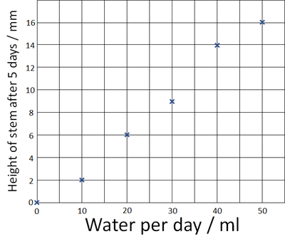
| − | | style="height:20px; width:400px; text-align:center;" | | + | | style="height:20px; width:400px; text-align:center;" |Plot the points on the graph using an X at each point. |
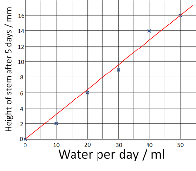
| − | | style="height:20px; width:400px; text-align:center;" | | + | | style="height:20px; width:400px; text-align:center;" |Draw one straight [[Line of Best Fit|line of best fit]] to the graph. |
|} | |} | ||
Revision as of 07:55, 24 August 2018
Key Stage 2
Meaning
A scatter graph is a graph that can be used to make predictions from an experiment.
About Scatter Graphs
- Scatter graphs use x's to plot points on the graph.
- A single line is drawn on a scatter graph called a line of best fit.
- The variable you change in the experiment goes on the x-axis.
- The variable you measure or count goes on the y-axis.
Plotting a Scatter Graph
| Use the results table to find the highest number. (On this table it's 16). | Amount of water was chosen to it goes on the x-axis and the height of the stem goes on the y-axis. Add the numbers on the axes up to the highest number. |
| Plot the points on the graph using an X at each point. | Draw one straight line of best fit to the graph. |


