Difference between revisions of "Scatter Graph"
| Line 24: | Line 24: | ||
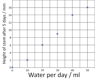
| style="height:20px; width:400px; text-align:center;" |Plot the points on the graph using an X at each point. | | style="height:20px; width:400px; text-align:center;" |Plot the points on the graph using an X at each point. | ||
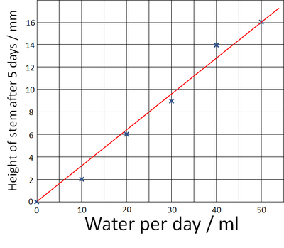
| style="height:20px; width:400px; text-align:center;" |Draw one straight [[Line of Best Fit|line of best fit]] to the graph. | | style="height:20px; width:400px; text-align:center;" |Draw one straight [[Line of Best Fit|line of best fit]] to the graph. | ||
| + | We can use this line to predict how tall the stem would have grown if we'd given it 25ml of water each day. | ||
|} | |} | ||
Revision as of 07:57, 24 August 2018
Key Stage 2
Meaning
A scatter graph is a graph that can be used to make predictions from an experiment.
About Scatter Graphs
- Scatter graphs use x's to plot points on the graph.
- A single line is drawn on a scatter graph called a line of best fit.
- The variable you change in the experiment goes on the x-axis.
- The variable you measure or count goes on the y-axis.
Plotting a Scatter Graph
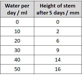
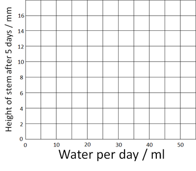
| Use the results table to find the highest number. (On this table it's 16). | Amount of water was chosen to it goes on the x-axis and the height of the stem goes on the y-axis. Add the numbers on the axes up to the highest number. |
| Plot the points on the graph using an X at each point. | Draw one straight line of best fit to the graph.
We can use this line to predict how tall the stem would have grown if we'd given it 25ml of water each day. |


